31 Oct 2009
Photo of the Day – Night Glow
Arizona Photography, Phoenix Area Photography, Photo of the Day No Comments Night Glow
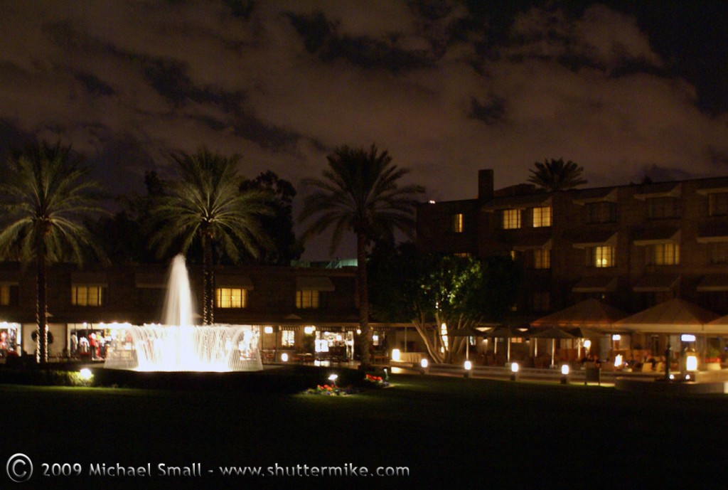
Biltmore Resort and Spa in Phoenix, AZ
Night Glow
Biltmore Resort and Spa in Phoenix, AZf/4.5 – ISO 800 – Focal Length 24 mm
Archives for October, 2009
31 Oct 2009
 Night Glow
Biltmore Resort and Spa in Phoenix, AZ
Night Glow
Biltmore Resort and Spa in Phoenix, AZWhen I first started taking my camera off automatic and manually adjusting the settings to take more control of my photography one of the main principles of photography that I struggled with was aperture. In fact, although the more I shoot the more I understand aperture, I have not yet reached the point where it is second nature. I often have to recite to myself “large number, small opening, small number, larger opening.” I’m sure I am not alone in this so I have put together a relatively simple explanation of aperture.
According to www.merriam-webster.com the definition of aperture is as follows:
ap·er·ture (āp’ər-chər) – noun – a : the opening in a photographic lens that admits the light b : the diameter of the stop in an optical system that determines the diameter of the bundle of rays traversing the instrument
That definition is a bit cumbersome, but one of the best comparisons I have found to help understand aperture is to the human eye. The iris of your eye regulates how much light is let in for your brain to decipher what you are seeing. In a dark setting your iris opens up to let more light in. In a bright setting your iris closes down since not as much light is needed to see your surroundings.
The aperture of a camera works in much the same way. Your camera (you) has a lens (your eye) with a diaphragm (your iris) that opens and closes based on the the lighting (either automatically by the camera or manually by the photographer) in order to regulate the amount of light that reached the film or sensor (your brain). Obviously in your camera, unlike in the human eye, there are other factors that work with the aperture to control the exposure such as shutter speed and ISO, but the basics of aperture by itself are much like the eye.
With the basic definition in mind, there is one significant and often difficult to comprehend, aspect of aperture that you are going to need to understand to master it. That is the f-stop numbers and how they relate to the size of the opening in the diaphragm. As the diagram below shows the larger the f-stop the smaller the diaphragm opening. That means you have to think opposite of what seems “normal.” To let less light in you need a bigger f-stop which results in a smaller opening. To let more light in you need a larger f-stop which results in a bigger opening.
Large f-stop = Small opening
Small f-stop = Large opening
Each camera model is going to be a little different. But in general, you have about four options for setting aperture.
Aperture impacts two closely related aspects of your photography, the exposure and depth of field. For the exposure you need to remember that it is dependent on more than just aperture. Shutter speed, film speed (ISO) and aperture play a role in determining a good exposure for an image and the three are closely related.
Aperture + Shutter Speed + ISO = Good Exposure
Aperture also plays a role in depth of field. The more you open up your aperture (the smaller the f-stop number) the more shallow your depth of field will be, i.e. your focal point will be in sharp focus while the foreground and background will blur. Conversely, when you close down your aperture (a larger f-stop number) the depth of field will be greater. Both the subject as well as the foreground and background will be in focus.
As with learning anything in photography, the key to mastering aperture is to experiment with it. Try using the various exposure modes on your camera (other than automatic), bracketing with the aperture, and seeing the effects of using a large aperture and a small aperture on the same subject. In time it will become second nature.
The day before Halloween these pumpkins and gourds seem appropriate. The photograph is also a good example of some basic photography concepts. Namely, depth of field, using complimentary colors and filling the frame. The depth of field is rather shallow with the focus point being the orange and white pumpkin in the middle. This leaves the large pumpkin in the rear and the front rim of the plate a bit out of focus. The orange of the gourds and the blue of the plate are complimentary (opposite each other) on the color wheel. the concept of filling the frame is pretty self explanatory. The entire subject of the image goes from one side to the other and top to bottom without leaving any non-subject related space around the edges.
28 Oct 2009
Hippie Gypsy is a “smoke shop” on 4th Ave. in Tucson, AZ. The building is covered in murals featuring “Hippie” counter culture icons such as Jim Morrison and the Beatles.
27 Oct 2009
I posted an image of the Wings of Phoenix Sculpture at the Arizona Biltmore Resort in Phoenix, AZ from a different angle in a past Photo of the Day. But from this angle the red flowers at the base of the statue really look like flames. So the story of the mythical bird rising out of the flames comes to life.
These photos were for a project I did on color. They represent several of the concepts I wrote about in the post 5 Ways to Use Color in Your Photography, including complimentary and analogous.
Lemons and Avacados Analogous colors of green and yellow f/5.6 – 1/160 sec – ISO 200 – Focal Length 55 mm Fall Gourds and Pumpkins Complimentary Colors of orange and blue f/5.6 – 1/160 sec – ISO 200 – Focal Length 60 mm Strawberries in a Bowl Complimentary Colors of red and cyan f/8 – 1/400 sec – ISO 100 – Focal Length 50 mm Lemons on Blue Complimentary Colors of blue and yellow f/16 – 0.4 sec – ISO 400 – Focal Length 70 mm26 Oct 2009
 For this post, when I talk about color in photography I am not talking about using color film vs black and white film (or changing a digital setting to black and white). Although the choice between shooting in color or black and white can be a critical one, this post is about using color to enhance your composition and even as the subject of your photograph. For many amateur photographers we don’t often think about the mechanics of color when shooting, but all those technical details can really help make or break an image.
First things first, you probably remember the color wheel from your art classes in elementary school. The color wheel is the basis of how colors relate to one another. The official definition (via Wikipedia) is:
An abstract illustrative organization of color hues around a circle, showing relationships between colors considered to be primary colors,secondary colors, complementary colors, etc.
Keeping the color wheel in mind there is a lot you can do with the composition and subject of your photographs. Here are 5 ways to experiment with color next time you are shooting.
1. Monochromatic
 In a monochromatic image one color is used in varying degrees of saturation (the intensity of a color) and lightness, or shade. This results in several contrasting shades of the same color in your photograph. Look for a scene with one central color, blue for example. Factors such as the lighting can influence the shade of that color and make for a more interesting image. Avoid the obvious such as a photograph of the sidewalk. Yes, that will result in a monochromatic photo, but the excessive lack of contrast can make for a boring photograph. Using some creativity and your photographer’s eye you are sure to find a subject with varying shades of one color that make the photo both monochromatic and interesting.
2. Analogous
 Analogous refers to two or more colors that are next to each other on the color wheel. Yellow and yellow-green for example. One color tends to be the dominant color in the image while the other(s) are used to enrich the overall image. An analogous photograph is similar to the monochromatic one, but offers more variation in color and tone. If you take your time you can find analogous subjects to photograph in both nature or the man-made environment. You could also set up your own scene and experiment with different analogous color schemes.
3. Complimentary
 Colors that compliment each other are opposite each other on the color wheel. Red and green or violet and yellow for example. When colors are opposite each other they are thought to be in balance when they appear together. The intensity of each color is also increased when complimentary colors appear next to each other. This is referred to as simultaneous contrast. You can easily set up a scene to capture complimentary colors by gathering some objects and arranging them together for your photograph. Or challenge yourself and head out to find complimentary colors in your everyday environment.
4. Color and Light
The source of the light you are shooting in can have a dramatic impact on how color is perceived. The intensity of sunlight, for example, differs by hour of the day and time of year. Early morning and late afternoon light is much warmer (red) than midday light which is cooler (blue). Shooting the same subject in varying natural light will impact the colors of that subject. Other lighting sources, such as shade, florescent and tungsten bulbs and even flash can all result in the same color appearing very different in your photograph.
A great way to get a feel for the impact different light sources can have on your subject is take one (portable) solid colored subject and photograph it in varying light sources. Shoot it in the morning and again at midday and at sunset. Then move it indoors and shoot under regular household light (usually tungsten). The tone and intensity of the color will vary, sometimes greatly, depending on your light source.
Top – Tungsten Light Source Bottom – Sunlight at Mid-Afternoon Light Source5. Color as the Subject
 Once you have an understanding of the color wheel and the various ways in which colors relate to each other you can step your photography up a notch and try getting artsy. One possibility is to use color itself as the subject of your photograph. Although there can still be a physical object in the photograph,work with the color itself making it the primary focus of the photograph. Use different tones, light intensities and complimentary, monochrome and analogous colors to create the image and see what you come up with.
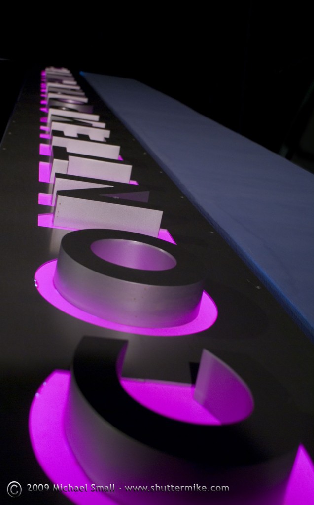
 Mesa Arts Center – Contempoary
f/5 – 1/15 sec – ISO 200 – Focal Length 30 mm
I have said this before about the Mesa Arts Center, but it is absolutely one of my all time favorite Phoenix area photography spots. Every time I go I see something new or in a new way. The colors, textures and light – both night and day – are awesome. I did a little research on the architect, Michael Tingley of Boora Architects, to see what some of his other work looks like. Unfortunately there is nothing else in Arizona, but he has done a number of arts centers across the US including these: